White Whale
Brand Website UI/UX, Content, Company Profile, Brochure
A Deep Dive
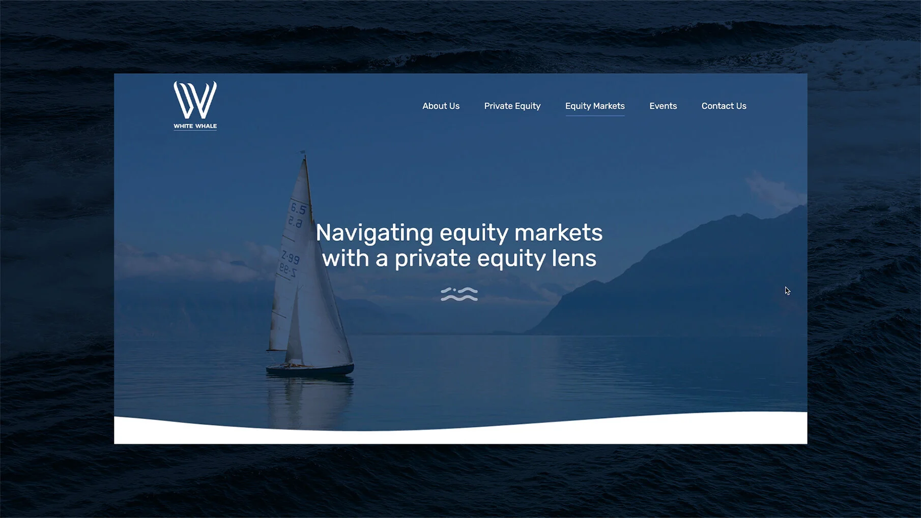
White Whale Partners started off in Private Equity, and after witnessing growth in their first few years wanted to expand their services to include a Portfolio Management service for HNI customers. Their core brand assets, like their website and company profile had to not just cater to potential investors, but also impress them.
While they had an existing website, we needed to revamp all their assets and bring in a fresh, consistent design language and tone that would extend across their services.
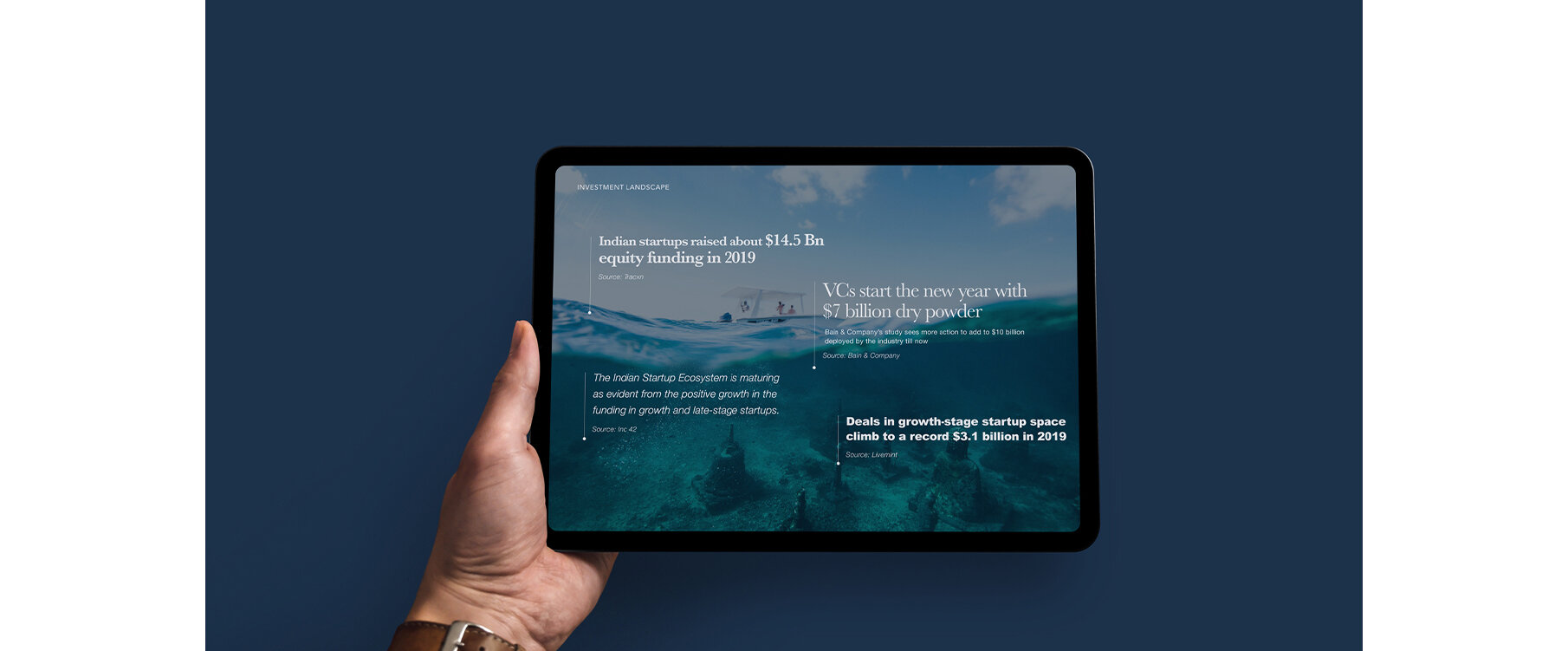
We started with defining the brand tone. Bringing in metaphors related to the ocean and sea were a natural choice given the brand’s name, but we had to strike a balance between being on theme and also being professional. We extended this to the design language with the use of imagery and colour tones that would compliment the content. On the website, simple animations were added to the page banners for them to feel like gentle waves. And while it was important to highlight and share relevant content, we wanted the visitor to have the option of expanding and closing sections depending on what information is relevant to them.
What resulted is a brand experience that will introduce (and we’re sure, impress) potential investors to the world of White Whale Partners.
Navigate & Enjoy: www.whitewhale.in


