

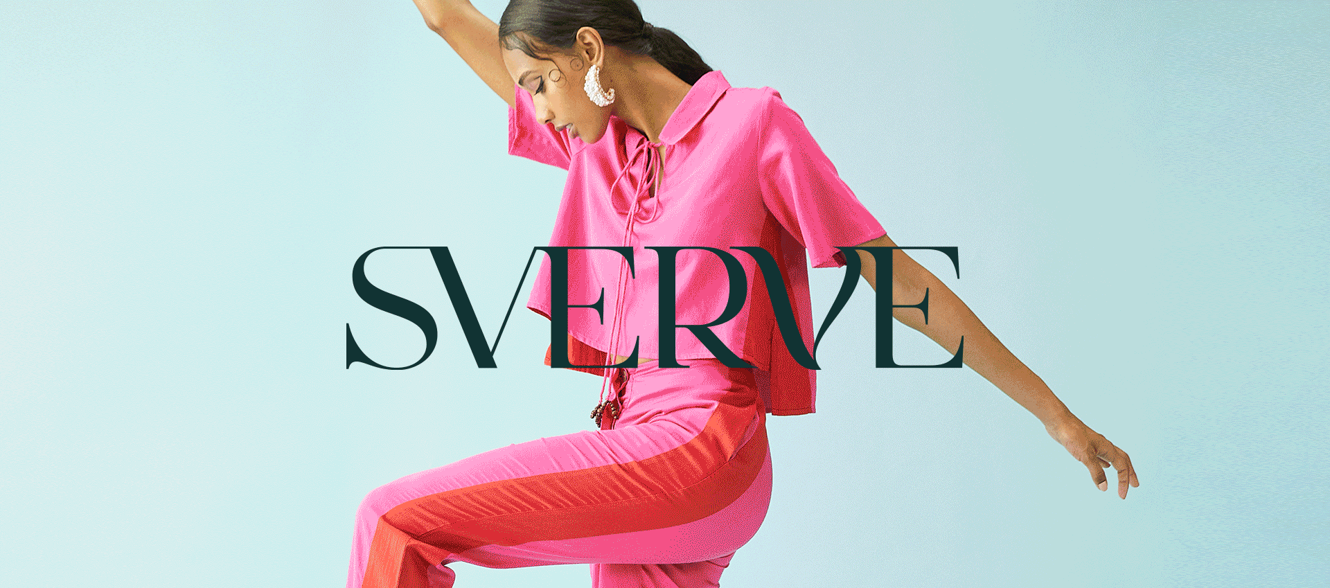
sverve
Brand Positioning, Brand Name & Logo, Website UI,UX & Content, Packaging, Social Media Content Buckets
Falling into Style!
The inception of Sverve happened over a lunch conversation between the co-founders Shikha Kajaria and Gayatri Reddy. They were talking about how hard it was to find western wear made by local designers. Voila! That’s when Sverve was born - a concept of curated, personalized, style marketplace that will give Indian women the opportunity to find the best of western fashion at competitive prices. Their ambition: To build a discerning fashion community that has access to the best designers, beautiful craftsmanship and most importantly, stylish fashion.
We fell in love with the idea when we were approached to bring this intuitive platform to life. Our journey started with naming the brand, to carving out a distinctive personality, to styling it via a brand identity, making it a home (website) for it to live and thrive, and lastly giving a voice.
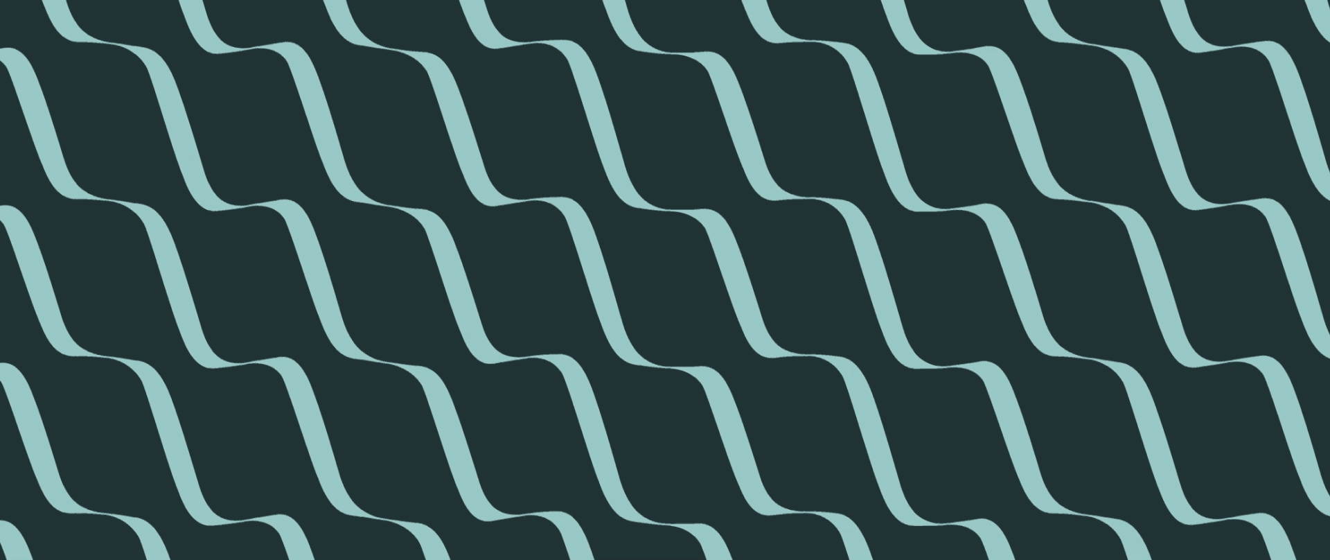

The name is inspired by the brand’s intent to give the fashion community a shopping destination that goes beyond mass fashion and gives them more discerning style. It is a play on the word “swerve” (to change courses) - and we infused the literal meaning of the name into our design language.

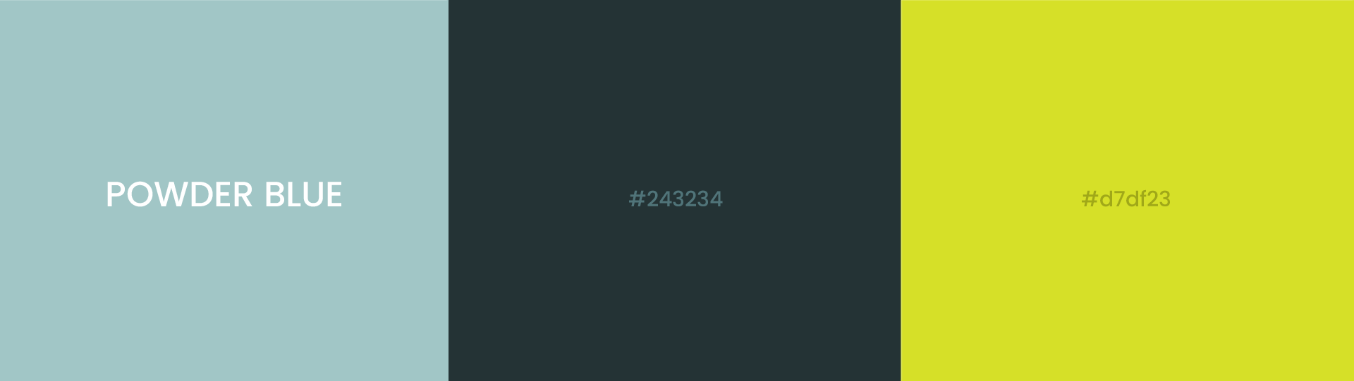
The brand goes beyond catering to typical social trends. It is personalized, curated and celebrates self expression. This sparked us to move away from an expected fashion palette of black and white into a more exclusive style. Enter a beautiful combination of powder blue and teal, with a pop of neon that pushes it just over the edge.


Inspired by the brand personality, the approach behind crafting the brand language and tone was to keep it simple, formal yet have a touch of style via clever lines. Our favourite were the many puns we cracked around the brand name Sverve. Happy to Sverve you, for example, was one of our favourites.


Sverve’s website had to be the embodiment of style, a go to place for western fusion wear. The design was heavily inspired by the brand ethos - personalization, curation, and everything bespoke. Our idea was to keep the UI clean and spotlight the collections. We meticulously designed the website to allow for an user-friendly browsing experience with an intuitive user journey that will makes it easy to shop. The result is an amazing, stylish, responsive digital address which builds a great first impression for our users to not just shop, but also fall into style.


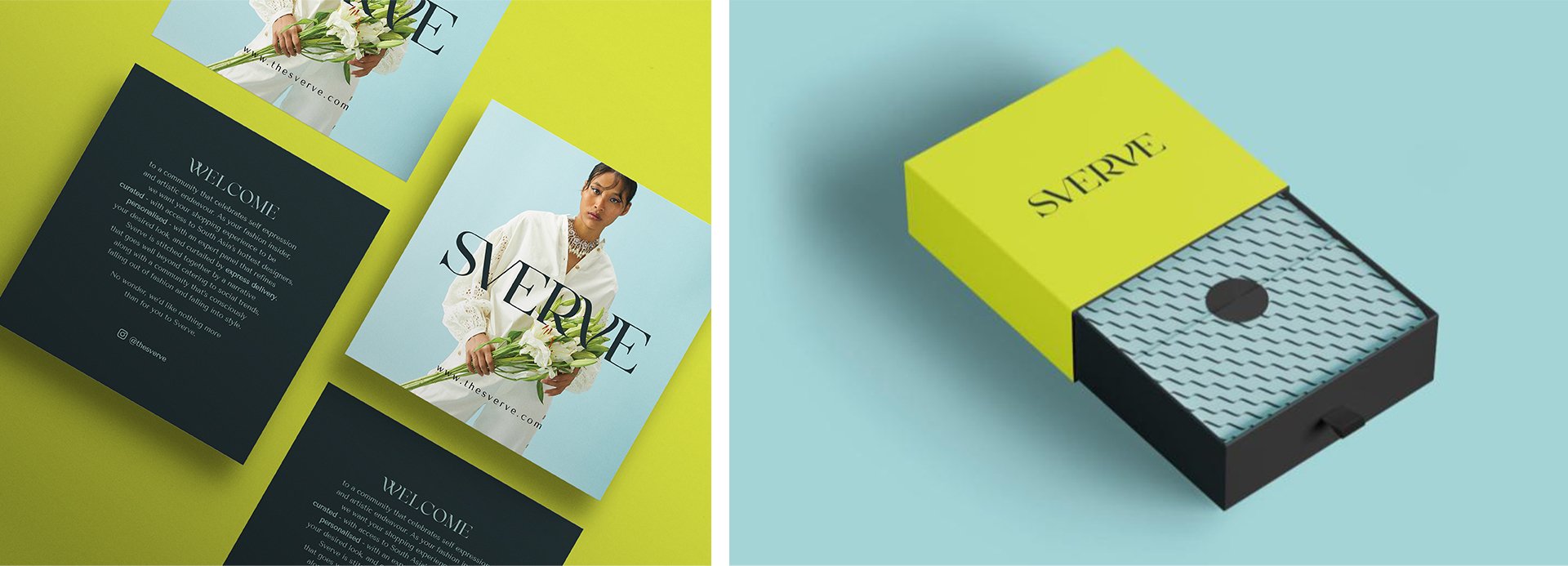
The merchandise is where the customer really interacts with the brand. The design language was minimalist and we leveraged the brand's colors, the pop of neon, the abstract brand pattern derived from the brand logo, to curate a design look that was both stylish and chic. The brand pattern formed a core element in several elements like the gift box, tape and butter paper. Now would you ever throw away something as gorgeous as this.

We gave them engaging social content buckets that they could use on their social page to generate conversations about the brand. The content was a platter of product/collections, designers in focus to the brand’s service USPs. We even proposed a special section on style expert who would curate stylish collections on the site, an unique, own-able name was coined for this section - “Stylesperts”


