The Alchemy
Brand Positioning, Logo, Packaging & Website Design
The inside-out journey to feeling beautiful
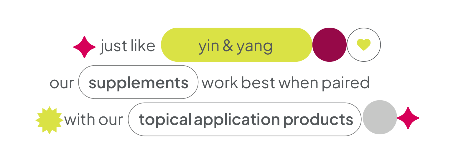
The Alchemy, as a skincare brand and product, has an interesting premise. They pair the long-term nourishment of edible supplements with the instant effects of topical skincare serums through a revolutionary inside-out approach to skin care. We were excited to come on-board for this project, but we realised there was a difficult problem to solve - the already cluttered skincare market.
Our research showed that skincare products are almost always a solution-oriented, skin-deep formulation. A cream for a zit or a serum for fine lines. Once you stop the application, the problem comes back. Because topical solutions don’t reach the root cause of the issue. The Alchemy solved this very problem with its holistic inside-out regime. And that’s where we sought inspiration - ‘Beautiful Inside & Out’ became the brand’s positioning. Furthermore, we rebranded their dual action products as ‘Power Duos’ to double down on it in the branding, packaging design as well as language for the brand.
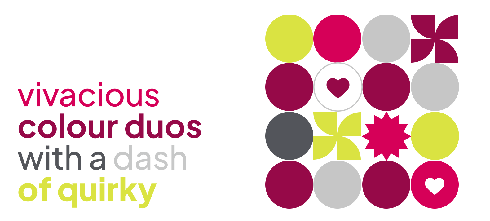
The Alchemy’s logo brings together two elements (representing inside and outside) to form an ‘a’. The visual identity uses a powerful and vibrant shade of pink, complemented by tones of dark pink, grey, white, and a pop of neon for some vivaciousness.


Our packaging design echoed the positioning as well. Every Power Duo contains an edible supplement pack and a topical serum pack. The visual design on their fronts is such that each connects with the other to help you see a bigger picture; therefore implying that you need to use both to get the full effect of the product.

We also devised strong patterns & colour connections for each variant for its distinct identity. They were derived from the benefit of the formulation. The anti-ageing duo was represented with a timeless bloom and a red-pink colour scheme, while the hydration duo flaunted a water drop with an aqua & navy blue combo.

We wanted to extend our brand positioning to The Alchemy’s brand language & personality as well. Salt & pepper, bread & butter, yin & yang - we used duos generously in the copy. A balance of credibility & self-assuredness was retained without being overly serious. With these parameters in mind, headlines, and copy for its packs, website, and related comms were crafted.